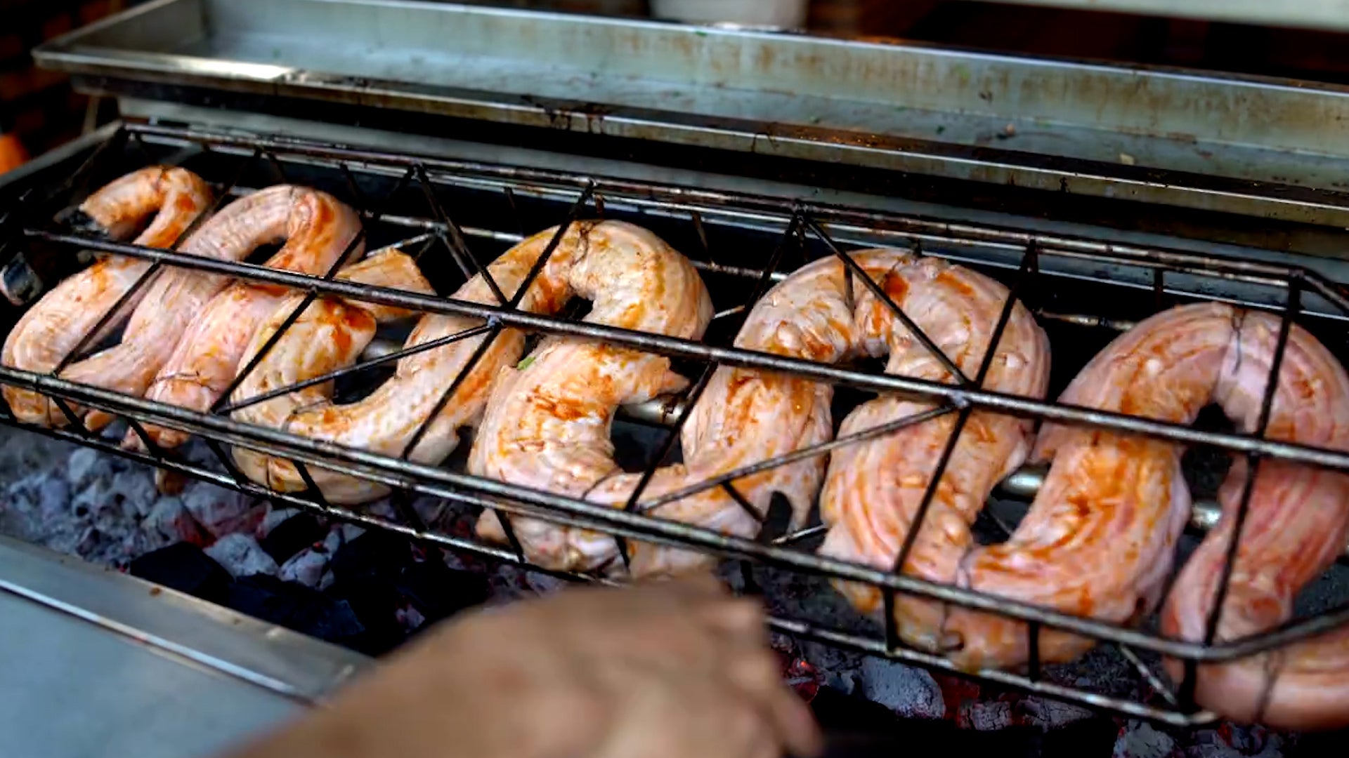
Dr. Ricky Rood's Climate Change Blog

Drought, Fire, Flood: In the News
Posted by: Dr. Ricky Rood, 05:22 GMT le 12 juillet 2011 +2
Drought, Fire, Flood: In the News

I have been writing about a variety of issues that I know are of interest to only a small number of people – U.S. science organizations, climate model software, and validation of climate models. I am going to move away from that arcane set of subjects for a while and spend a little more time in the climate mainstream. In this entry I want to touch on several subjects – starting with my garden.

My garden is in the flat land that is the western edge of the Great Plains, just east of Boulder, Colorado. Weather wise, it is a complex and difficult environment: more than 5000 feet above sea level, reliant upon water from the winter snow pack in the mountains, huge swings of hot and cold. In terms of climate types, I have seen region defined as both arid and semiarid. In the last week, we have had three or more inches of rain – hard driving rain with much lightning. There is water standing between the rows in the garden. The week of July 4 it was so dry there was a fire ban, and many firework fires.

Last summer in Boulder we had the Fourmile Fire, which burned thousands of acres and dozens of houses. With this rain, we have mudslides, rock slides and flash floods (Longmont Times Call). It all makes you appreciate the importance of the weather and the climate. Wet and dry. Hot and cold. ( 485 Billion Dollar Impact of Weather)

Boulder is a microcosm of what is going on in the U.S. There have been overwhelming fires in Arizona, New Mexico, and Texas. (Texas Fires). Dangerous drought and heat is spreading all across the southern half of the U.S. The dust storm last week in Arizona was reminiscent of pictures of the Dust Bowl. (more here). We were overwhelmed not long ago by the Mississippi River flooding. I have almost forgotten about the Missouri River flooding.


Figure 1: From KFAB Omaha News Radio. Photo Credit AP: Missouri River flood of Calhoun Nuclear Power Plant.

We see here the persistence of weather, climate, snow cover, drought, floods - one extreme after another. Jeff Master’s wrote an excellent summary of 2010-2011 as being a year of the most extreme events since 1816 – the year of Mount Tambora, a definitive and understood climate anomaly. Jeff writes that June 2011 continues the run. July 2011 is looking strong. It has been more than 300 months since there was a “below average” mean temperature. That’s a little compelling.

We are being handed one case study after another, where we see the impact that weather and climate have on us. And what is that impact? We see vulnerable people losing their homes, their crops. But where is the real threat? What does it mean that 213 counties in Texas are primary disaster areas?

Energy, economy, population – markets. We all know that the weather affects our economy. We rely on a stable climate. We see here and now an interconnected world, where extreme heat kills thousands and destroys crops and send food prices soaring. We see multiple billion dollar liens placed on our economy by floods, droughts, and tornadoes. These costs come at a time when economies all around the world are weak. There is a debt crisis, and the weather is demanding more loans. Right here and now the world is providing one climate disaster after another. The weather and climate are showing the need for more planning, for building resilience and recovery strategies. The weather and climate are revealing our vulnerabilities. While there is the obvious, the family fleeing the flood, the destroyed Joplin, Missouri hospital, there is also the accumulated impact felt through markets, higher food prices, emergency relief, things that will not be fixed, people relocating.

We are being offered lessons. I have written this far and not strung together the words “climate change” or mentioned “global warming.” This is the weather in our warming climate. The take away message from climate models, Be Prepared.

r

Rood on To the Point

Open Climate Modeling:

Greening of the Desert

Stickiness and Climate Models

Open Source Communities, What are the Problems?

A Culture of Checking


Organizing U.S. Climate Modeling:

Something New in the Past Decade?

The Scientific Organization

A Science-Organized Community

Validation and the Scientific Organization
  Permalink | A A A
Reader Comments
Display: 0, 50, 100, 200 Sort: Newest First - Order Posted
Viewing: 201 - 251

Page: 1 | 2 | 3 | 4 | 5 | 6 | 7 | 8 | 9 | 10 | 11 | 12Blog Index

201. cyclonebuster 20:43 GMT le 13 juillet 2011    
Quoting iceagecoming:
July 11, 2011, 10:08 p.m. EDT
Support for Australian government hits record low

By Enda Curran

SYDNEY -(MarketWatch)- The Labor-led government of Australian Prime Minister Julia Gillard came under renewed pressure Tuesday with a closely watched opinion poll showing its popularity at record lows just days after it introduced the terms of a controversial tax on carbon emissions.

Voter approval for Gillard's Labor party has fallen to 27%--a record low--while backing for the centre right Liberal-National opposition has grown to 49%, according to the Newspoll survey of 1,200 voters conducted for The Australian newspaper between July 8 and July 10. The bulk of voters were questioned before details of the carbon tax were released on Sunday.

Much of Labor's problems are linked to an unpopular plan to place a fixed 23 Australian dollars (US$24) price per ton of carbon emitted by the 500 biggest polluters from the middle of 2012, followed by a transition to a floating rate regime in 2015. Criticism ranges from Australia moving ahead of trading competitors in pricing carbon to worries the policy will drive higher the cost of living.

Support for the opposition is now at its highest since October 2001, when the party was in government under Prime Minister John Howard and enjoyed a surge in support in the wake of the terrorist attacks in the U.S.. On a two party preferred basis, which factors in vote transfers, the conservatives lead by 58% to 42%. Worryingly for Gillard, opposition leader Tony Abbott has emboldened his lead as preferred Prime Minister to 43% from 38%.

Abbott has led a vigorous campaign against the carbon tax, forcing Gillard to offer billions of dollars in compensation to households and businesses affected by the scheme. But Gillard has consistently dismissed the poor opinion polls and has banked her political fortune on securing approval for the carbon scheme between now and the next election
scheduled in 2013.

Link

I can only hope the current administration will follow the Australian approach. Right boys.


How much Tax money will be made taxing carbon?
Member Since: 2 janvier 2006 Posts: 127 Comments: 18747
202. PurpleDrank 20:48 GMT le 13 juillet 2011    
how does generating tax revenue decrease co2?

as if profits and wealth have anything to do with climate science
Member Since: 17 août 2010 Posts: 1 Comments: 730
203. sirmaelstrom 20:50 GMT le 13 juillet 2011    
№ 199
Quoting cyclonebuster:


Lets see he was talking about this years drought in 2011. The chart you are showing only shows up to 2006.


Check the percentage of the spike in his graph and compare it to the longer term. Do you think that it is significant historically? Below is his previous graph, for ease of comparison.


Apparently comes from the NYTimes, here.

Edited for ease of reading
Member Since: 19 février 2010 Posts: 0 Comments: 568
204. cyclonebuster 20:55 GMT le 13 juillet 2011    
Quoting PurpleDrank:
how does generating tax revenue decrease co2?

as if profits and wealth have anything to do with climate science


It could if they invested the tax money the right way!
Member Since: 2 janvier 2006 Posts: 127 Comments: 18747
205. PurpleDrank 21:04 GMT le 13 juillet 2011    
Bond events are North Atlantic climate fluctuations occurring every ≈1,470 ± 500 years throughout the Holocene. Eight such events have been identified, primarily from fluctuations in ice-rafted debris. Bond events may be the interglacial relatives of the glacial Dansgaard-Oeschger events, with a magnitude of perhaps 15-20% of the glacial-interglacial temperature change.

The theory of 1,500-year climate cycles in the Holocene was postulated by Gerard C. Bond of the Lamont-Doherty Earth Observatory at Columbia University, mainly based on petrologic tracers of drift ice in the North Atlantic.[1][2]

The existence of climatic changes, possibly on a quasi-1,500 year cycle, is well established for the last glacial period from ice cores. Less well established is the continuation of these cycles into the holocene. Bond et al. (1997) argue for a cyclicity close to 1470 ± 500 years in the North Atlantic region, and that their results imply a variation in Holocene climate in this region. In their view, many if not most of the Dansgaard-Oeschger events of the last ice age, conform to a 1,500-year pattern, as do some climate events of later eras, like the Little Ice Age, the 8.2 kiloyear event, and the start of the Younger Dryas.

The North Atlantic ice-rafting events happen to correlate with most weak events of the Asian monsoon over the past 9,000 years,[3][4] as well as with most aridification events in the Middle East.[5] Also, there is widespread evidence that a ≈1,500 yr climate oscillation caused changes in vegetation communities across all of North America.[6]

For reasons that are unclear, the only Holocene Bond event that has a clear temperature signal in the Greenland ice cores is the 8.2 kyr event.

The hypothesis holds that the 1,500-year cycle displays nonlinear behavior and stochastic resonance; not every instance of the pattern is a significant climate event, though some rise to major prominence in environmental history.[7] Causes and determining factors of the cycle are under study; researchers have focused attention on variations in solar output, and "reorganizations of atmospheric circulation."[7] Bond events may also be correlated with the 1800 year lunar tidal cycle. [8]


List of Bond events

Most Bond events do not have a clear climate signal; some correspond to periods of cooling, others are coincident with aridification in some regions.
≈1,400 BP (Bond event 1) — roughly correlates with the Migration Period pessimum (450–900 AD)
≈2,800 BP (Bond event 2) — roughly correlates with the Iron Age Cold Epoch (900–300 BC)[9]
≈4,200 BP (Bond event 3) — correlates with the 4.2 kiloyear event (correlates also with the collapse of the Akkadian Empire and the end of the Egyptian Old Kingdom)
≈5,900 BP (Bond event 4) — correlates with the 5.9 kiloyear event (correlates with the end of the Pre Pottery Neolithic B, and the arrival of nomadic pastoralists in the Middle East)
≈8,100 BP (Bond event 5) — correlates with the 8.2 kiloyear event
≈9,400 BP (Bond event 6) — correlates with the Erdalen event of glacier activity in Norway,[10] as well as with a cold event in China.[11]
≈10,300 BP (Bond event 7) — unnamed event (correlates with the beginnings of grain agriculture in the Middle East)
≈11,100 BP (Bond event 8) — coincides with the transition from the Younger Dryas to the boreal
Member Since: 17 août 2010 Posts: 1 Comments: 730
206. iceagecoming 21:12 GMT le 13 juillet 2011    
Oceanic seesaw links Northern and Southern hemisphere during abrupt climate change
Published: Wednesday, February 25, 2009 - 13:42 in Earth & Climate

Very large and abrupt changes in temperature recorded over Greenland and across the North Atlantic during the last Ice Age were actually global in extent, according to an international team of researchers led by Cardiff University. New research, published in the journal Nature today, supports the idea that changes in ocean circulation within the Atlantic played a central role in abrupt climate change on a global scale.

Using a sediment core taken from the seafloor in the South Atlantic, the team were able to create a detailed reconstruction of ocean conditions in the South Atlantic during the final phases of the last ice age.

Dr Stephen Barker, Cardiff University's School of Earth and Ocean Sciences and lead author on the paper, said: "During this period very large and abrupt changes in temperature were observed across the North Atlantic region. However, evidence for the direct transmission of these shifts between the northern and southern hemispheres has so far been lacking".

The new study suggests that abrupt changes in the north were accompanied by equally abrupt but opposite changes in the south. It provides the first concrete evidence of an immediate seesaw connection between the North and South Atlantic. The data shows, for example, that an abrupt cooling in the north would be accompanied by a rapid southerly shift of ocean fronts in the Southern Ocean, followed by more gradual warming across the south.

Dr Barker explains: "The most intuitive way to explain these changes is by varying the strength of ocean circulation in the Atlantic. By weakening the circulation, the heat transported northwards would be retained in the south."

Climate physicist, Dr Gregor Knorr, co-author of the study and now based at the Alfred Wegener Institute in Germany, said: "Our new results agree with climate models that predict a rapid transmission of climate signals between the two hemispheres as a consequence of abrupt changes in ocean circulation."

The study has wide implications for our understanding of abrupt climate change. Dr Ian Hall, School of Earth and Ocean Sciences, said: "While it is unlikely that an abrupt change in climate, related to changes in ocean circulation, will occur in the near future, our results suggest that if such an extreme scenario did occur, its effects could be felt globally within years to decades."
Source: Cardiff University
Member Since: 27 janvier 2009 Posts: 21 Comments: 852
207. cyclonebuster 21:13 GMT le 13 juillet 2011    
Quoting sirmaelstrom:
№ 199


Check the percentage of the spike in his graph and compare it to the longer term. Do you think that it is significant historically? Below is his previous graph, for ease of comparison.


Apparently comes from the NYTimes, here.

Edited for ease of reading


Well in the article under the graphic it does say in recent years. Could be they cherrypicked the years. To be fair they should have shown the much longer time period of past droughts from .gov sources.
Member Since: 2 janvier 2006 Posts: 127 Comments: 18747
208. Neapolitan 21:15 GMT le 13 juillet 2011    
Quoting sirmaelstrom:
@Neapolitan

I just remembered...You posted something at the end of the last blog entry's comment section [%u2116 546] about the "spike" of percentage of severe drought in the US using a five-year graph. I responded with a map of July 1934 showing a far higher percentage of severe drought in the US than anything in the last five years [last blog, %u2116 572]. You responded with a remark that it was only "one-month" and seemed to reply it was an aberration [%u2116 611].

Well, I suggest that you use the link I provided previously[see below] and check some other months as well. You can use this graph as a guide.


JBastardi provided a link that leads to this graph in %u2116 171. It comes from testimony given to Congress and allegedly originates from the NCDC. Although I can't find it on the site specifically, I did spot check a number of months using the NCDC link [I'll give it again at the end of this post] and it appears to be consistent with NCDC data. I again welcome and encourage you to check some yourself, as if the graph is not correct I will want to remove it from post.

If you find that it is indeed consistent with NCDC data, I imagine you'll admit that the "spike" in your previous 5-year data graph was rather insignificant historically after all. Of course, some say that I have a fairly active imagination, so maybe not.

Link to Histroical Palmer Drought Indices. Once again, note that you can select other months.

You know, I'm going to go back and provide a link forward to this post too, so that anyone reading the comments on the last blog entry can be properly informed.


Looking at the two tells me--not for the first time--that Bastardi (and Goddard, too, as this was on his site today as well) are perhaps a bit too gullible to see the obvious flaws in their lame attempt at comparative climate. Please allow me:

1) The NYT graph shows only "extreme" to "exceptional" drought. On the other hand, the wishful thinking Goddard/Bastardi graph shows "moderate" drought, as well.

On that fact alone, the comparisons are as false as Washington's teeth. Strike 1.

2) The Goddard/Bastardi graph doesn't mention which Palmer Drought Index it's using. Is that the Palmer Z Index? The Palmer Hydrological Drought Index (PHDI)? The Palmer Modified Drought Index (PMDI)? The Palmer Drought Severity Index (PDSI)? More to the point, do they even know the difference?

Strike 2.

3) The Goddard/Bastardi graph runs back to the 1900s, a time when--of course--the country simply wasn't as large as it is now. You know, fewer states. According to the NOAA numbers, the NYT graph is using data for all 50 states; the Goddard/Bastardi one can't be.

(Note; I ,em>may be wrong about the last one; I'm still looking onto it. But even if not, strikes 1 and 2 are enough to call an out.)

That's strike 3, I'm afraid. I imagine that's pretty frustrating. Looks like the phantom and the bodybuilder will need to go back to the Great Bottomless Well of Denialism to find something else. I wish them luck; they're going to need it.
Member Since: 8 novembre 2009 Posts: 4 Comments: 11143
209. cyclonebuster 21:16 GMT le 13 juillet 2011    
Quoting iceagecoming:
Oceanic seesaw links Northern and Southern hemisphere during abrupt climate change
Published: Wednesday, February 25, 2009 - 13:42 in Earth & Climate

Very large and abrupt changes in temperature recorded over Greenland and across the North Atlantic during the last Ice Age were actually global in extent, according to an international team of researchers led by Cardiff University. New research, published in the journal Nature today, supports the idea that changes in ocean circulation within the Atlantic played a central role in abrupt climate change on a global scale.

Using a sediment core taken from the seafloor in the South Atlantic, the team were able to create a detailed reconstruction of ocean conditions in the South Atlantic during the final phases of the last ice age.

Dr Stephen Barker, Cardiff University's School of Earth and Ocean Sciences and lead author on the paper, said: "During this period very large and abrupt changes in temperature were observed across the North Atlantic region. However, evidence for the direct transmission of these shifts between the northern and southern hemispheres has so far been lacking".

The new study suggests that abrupt changes in the north were accompanied by equally abrupt but opposite changes in the south. It provides the first concrete evidence of an immediate seesaw connection between the North and South Atlantic. The data shows, for example, that an abrupt cooling in the north would be accompanied by a rapid southerly shift of ocean fronts in the Southern Ocean, followed by more gradual warming across the south.

Dr Barker explains: "The most intuitive way to explain these changes is by varying the strength of ocean circulation in the Atlantic. By weakening the circulation, the heat transported northwards would be retained in the south."

Climate physicist, Dr Gregor Knorr, co-author of the study and now based at the Alfred Wegener Institute in Germany, said: "Our new results agree with climate models that predict a rapid transmission of climate signals between the two hemispheres as a consequence of abrupt changes in ocean circulation."

The study has wide implications for our understanding of abrupt climate change. Dr Ian Hall, School of Earth and Ocean Sciences, said: "While it is unlikely that an abrupt change in climate, related to changes in ocean circulation, will occur in the near future, our results suggest that if such an extreme scenario did occur, its effects could be felt globally within years to decades."
Source: Cardiff University


Greenland
Cities
Place Alerts Temp. Humidity Pressure Conditions Wind Updated
Aasiaat 45 °F 81% 29.74 in Mostly Cloudy West at 8 mph 6:50 PM WGST Save
Angisoq 42 °F 68% 29.81 in South at 8 mph 4:00 PM WGST Save
Aputiteeq 39 °F 74% 29.82 in West at 4 mph 4:00 PM WGST Save
Cape Harald Moltke Save
Cape Tobin 37 °F 93% 29.83 in N/A South at 12 mph 8:50 PM EGST Save
Carey Island 44 °F 73% 29.69 in ESE at 4 mph 3:00 PM ADT Save
Daneborg 42 °F 68% 29.84 in ESE at 15 mph 4:00 PM WGST Save
Danmarkshavn Save
Hall Land 36 °F 93% 29.79 in Partly Cloudy North at 6 mph 3:00 PM MDT Save
Henrik Kroeyer Holme 35 °F 88% 29.81 in SW at 9 mph 4:00 PM WGST Save
Ikermiit 51 °F 79% 29.80 in SSW at 1 mph 4:00 PM WGST Save
Ikermiuarsuk 47 °F 83% 29.82 in NW at 5 mph 4:00 PM WGST Save
Illoqqortoormiut 37 °F 93% 29.83 in N/A South at 12 mph 8:50 PM EGST Save
Ilulissat 52 °F 71% 29.71 in Mostly Cloudy West at 5 mph 6:50 PM WGST Save
Kangerlussuaq 55 °F 67% 29.71 in Mostly Cloudy SW at 5 mph 6:50 PM WGST Save
Kangilinnguit Save
Kap Morris Jesup 37 °F 89% 29.75 in West at 13 mph 4:00 PM WGST Save
Kitsissorsuit 44 °F 87% 29.74 in SSE at 10 mph 4:00 PM WGST Save
Kitsissut 46 °F 87% 29.77 in Mostly Cloudy East at 6 mph 6:50 PM WGST Save
Kulusuk 45 °F 87% 29.83 in Mostly Cloudy East at 4 mph 6:50 PM WGST Save
Maniitsoq 43 °F 87% 29.77 in Mostly Cloudy SSE at 7 mph 6:50 PM WGST Save
Mittarfik Nuuk 43 °F 81% 29.77 in Scattered Clouds SSW at 8 mph 6:50 PM WGST Save
Narsarsuaq 57 °F 55% 29.74 in Mostly Cloudy WSW at 10 mph 6:50 PM WGST Save
Navy Operated Save
Nerlerit Inaat 37 °F 93% 29.83 in N/A South at 12 mph 8:50 PM EGST Save
Nunarsuit 39 °F 79% 29.80 in SE at 5 mph 4:00 PM WGST Save
Nuuk 43 °F 81% 29.77 in Scattered Clouds SSW at 8 mph 6:50 PM WGST Save
Nuussuaataa 44 °F 80% 29.72 in NNW at 7 mph 4:00 PM WGST Save
Paamiut 44 °F 66% 29.79 in Mostly Cloudy West at 7 mph 4:00 PM WGST Save
Pituffik 44 °F 74% 29.70 in Scattered Clouds West at 6 mph 5:55 PM ADT Save
Prins Christian Sund 49 °F 74% 29.80 in Scattered Clouds NNE at 13 mph 4:00 PM WGST Save
Qaanaaq Save
Qaarsut 50 °F 82% 29.70 in North at 2 mph 4:00 PM WGST Save
Qaqortoq 57 °F 55% 29.74 in Mostly Cloudy WSW at 10 mph 6:50 PM WGST Save
Sioralik 43 °F 87% 29.77 in Mostly Cloudy SSE at 7 mph 6:50 PM WGST Save
Sisimiut 46 °F 87% 29.77 in Mostly Cloudy East at 6 mph 6:50 PM WGST Save
Sisimiut Mittarfia 46 °F 87% 29.77 in Mostly Cloudy East at 6 mph 6:50 PM WGST Save
Station Nord 34 °F 99% 29.81 in WSW at 4 mph 4:00 PM WGST Save
Station Nord Save
Summit 22 °F 56% in East at 4 mph 4:00 PM WGST Save
Tasiilaq 45 °F 87% 29.83 in Mostly Cloudy East at 4 mph 6:50 PM WGST Save
Ukiivik 41 °F 85% 29.80 in WSW at 4 mph 4:00 PM WGST Save
Upernavik 57 °F 51% 29.71 in Partly Cloudy East at 4 mph 6:50 PM WGST Save
Member Since: 2 janvier 2006 Posts: 127 Comments: 18747
210. atmoaggie 21:17 GMT le 13 juillet 2011    
Quoting sirmaelstrom:
@Neapolitan

I just remembered...You posted something at the end of the last blog entry's comment section [%u2116 546] about the "spike" of percentage of severe drought in the US using a five-year graph. I responded with a map of July 1934 showing a far higher percentage of severe drought in the US than anything in the last five years [last blog, %u2116 572]. You responded with a remark that it was only "one-month" and seemed to reply it was an aberration [%u2116 611].

Well, I suggest that you use the link I provided previously[see below] and check some other months as well. You can use this graph as a guide.


JBastardi provided a link that leads to this graph in %u2116 171. It comes from testimony given to Congress and allegedly originates from the NCDC. Although I can't find it on the site specifically, I did spot check a number of months using the NCDC link [I'll give it again at the end of this post] and it appears to be consistent with NCDC data. I again welcome and encourage you to check some yourself, as if the graph is not correct I will want to remove it from post.

If you find that it is indeed consistent with NCDC data, I imagine you'll admit that the "spike" in your previous 5-year data graph was rather insignificant historically after all. Of course, some say that I have a fairly active imagination, so maybe not.

Link to Histroical Palmer Drought Indices. Once again, note that you can select other months.

You know, I'm going to go back and provide a link forward to this post too, so that anyone reading the comments on the last blog entry can be properly informed.

Oh, that's inconvenient...

It appears that drought episodes aren't a new thing?
Member Since: 16 août 2007 Posts: 6 Comments: 12461
211. sirmaelstrom 21:25 GMT le 13 juillet 2011    
Quoting PurpleDrank:
Bond events are North Atlantic climate fluctuations occurring every %u22481,470 500 years throughout the Holocene. Eight such events have been identified, primarily from fluctuations in ice-rafted debris. Bond events may be the interglacial relatives of the glacial Dansgaard-Oeschger events, with a magnitude of perhaps 15-20% of the glacial-interglacial temperature change.

The theory of 1,500-year climate cycles in the Holocene was postulated by Gerard C. Bond of the Lamont-Doherty Earth Observatory at Columbia University, mainly based on petrologic tracers of drift ice in the North Atlantic.[1][2]

The existence of climatic changes, possibly on a quasi-1,500 year cycle, is well established for the last glacial period from ice cores. Less well established is the continuation of these cycles into the holocene. Bond et al. (1997) argue for a cyclicity close to 1470 500 years in the North Atlantic region, and that their results imply a variation in Holocene climate in this region. In their view, many if not most of the Dansgaard-Oeschger events of the last ice age, conform to a 1,500-year pattern, as do some climate events of later eras, like the Little Ice Age, the 8.2 kiloyear event, and the start of the Younger Dryas.

The North Atlantic ice-rafting events happen to correlate with most weak events of the Asian monsoon over the past 9,000 years,[3][4] as well as with most aridification events in the Middle East.[5] Also, there is widespread evidence that a %u22481,500 yr climate oscillation caused changes in vegetation communities across all of North America.[6]

For reasons that are unclear, the only Holocene Bond event that has a clear temperature signal in the Greenland ice cores is the 8.2 kyr event.

The hypothesis holds that the 1,500-year cycle displays nonlinear behavior and stochastic resonance; not every instance of the pattern is a significant climate event, though some rise to major prominence in environmental history.[7] Causes and determining factors of the cycle are under study; researchers have focused attention on variations in solar output, and "reorganizations of atmospheric circulation."[7] Bond events may also be correlated with the 1800 year lunar tidal cycle. [8]


List of Bond events

Most Bond events do not have a clear climate signal; some correspond to periods of cooling, others are coincident with aridification in some regions.
%u22481,400 BP (Bond event 1) %u2014 roughly correlates with the Migration Period pessimum (450%u2013900 AD)
%u22482,800 BP (Bond event 2) %u2014 roughly correlates with the Iron Age Cold Epoch (900%u2013300 BC)[9]
%u22484,200 BP (Bond event 3) %u2014 correlates with the 4.2 kiloyear event (correlates also with the collapse of the Akkadian Empire and the end of the Egyptian Old Kingdom)
%u22485,900 BP (Bond event 4) %u2014 correlates with the 5.9 kiloyear event (correlates with the end of the Pre Pottery Neolithic B, and the arrival of nomadic pastoralists in the Middle East)
%u22488,100 BP (Bond event 5) %u2014 correlates with the 8.2 kiloyear event
%u22489,400 BP (Bond event 6) %u2014 correlates with the Erdalen event of glacier activity in Norway,[10] as well as with a cold event in China.[11]
%u224810,300 BP (Bond event 7) %u2014 unnamed event (correlates with the beginnings of grain agriculture in the Middle East)
%u224811,100 BP (Bond event 8) %u2014 coincides with the transition from the Younger Dryas to the boreal


When I look at that, I think to myself: "Man...What a mess!". The different proxies have little agreement with one another on a scale of less than one degree. However, when you average them all together, you get a nice flat line with little variation. Pretty convenient, if that's what you wish to show. Of course, it's worth investigating whether any of the proxies used can actually predict temperature with a few tenths of a degree at any point, as well as how precise each proxy is temporally (i.e. what is the shortest time period that they have a reasonable correlation). I imagine that the actual year-to-year global temperature graph for the referenced time period, if it were available, would likely look nothing like any of the lines on that chart. It would certainly be much noisier with more pronounced maxima and minima.

Edited: Corrected typos
Member Since: 19 février 2010 Posts: 0 Comments: 568
212. cyclonebuster 21:28 GMT le 13 juillet 2011    
Cryosat-2


Link


Member Since: 2 janvier 2006 Posts: 127 Comments: 18747
213. sirmaelstrom 21:37 GMT le 13 juillet 2011    
№ 208
Quoting Neapolitan:

Looking at the two tells me--not for the first time--that Bastardi (and Goddard, too, as this was on his site today as well) are perhaps a bit too gullible to see the obvious flaws in their lame attempt at comparative climate. Please allow me:

1) The NYT graph shows only "extreme" to "exceptional" drought. On the other hand, the wishful thinking Goddard/Bastardi graph shows "moderate" drought, as well.

On that fact alone, the comparisons are as false as Washington's teeth. Strike 1.

2) The Goddard/Bastardi graph doesn't mention which Palmer Drought Index it's using. Is that the Palmer Z Index? The Palmer Hydrological Drought Index (PHDI)? The Palmer Modified Drought Index (PMDI)? The Palmer Drought Severity Index (PDSI)? More to the point, do they even know the difference?

Strike 2.

3) The Goddard/Bastardi graph runs back to the 1900s, a time when--of course--the country simply wasn't as large as it is now. You know, fewer states. According to the NOAA numbers, the NYT graph is using data for all 50 states; the Goddard/Bastardi one can't be.

(Note; I ,em>may be wrong about the last one; I'm still looking onto it. But even if not, strikes 1 and 2 are enough to call an out.)

That's strike 3, I'm afraid. I imagine that's pretty frustrating. Looks like the phantom and the bodybuilder will need to go back to the Great Bottomless Well of Denialism to find something else. I wish them luck; they're going to need it.


The graph is part of testimony to Congress, as I linked, where within it lists NCDC as a source. It was first linked here by JBastardi, a commenter here who may be but most likely isn't Bastardi himself. Steven Goddard simply posted it on his blog, I linked the original source, which renders one of your "strikes" moot.

Even in the map from the NYTimes there doesn't seem to be significant difference between the amount of the country under "moderate to exceptional" drought and "extreme to exceptional". Anyway, why include the moderate drought area if it's not included in the graph to the left? I bet it is.

There's probably some differences in the specific indices used, but seriously, you think it's going to somehow going lower the 50% values in the long-term graph down to the 20% value in the NYTimes graph? Seriously? You may have to provide some corroborating evidence for such a wild claim.

Edited
Member Since: 19 février 2010 Posts: 0 Comments: 568
214. sirmaelstrom 21:42 GMT le 13 juillet 2011    
Quoting atmoaggie:
Oh, that's inconvenient...

It appears that drought episodes aren't a new thing?


Who'd a thunk it?
Member Since: 19 février 2010 Posts: 0 Comments: 568
215. PurpleDrank 21:46 GMT le 13 juillet 2011    
the real comedy of today's climate debate is from all of the extreme droughts in history past, whether they reoccur in a pattern or not, are still being evaluated thousands of years after the last glacial maximum, but the last 3 decades have a definitive cause and effect..AGW through means of burning fossil fuel.

how about man redirecting rivers
constructing dams
removing forests to build structures
stopping fires prematurely and not letting nature take its course
lunar cycles
solar activity
plate tectonics
water and land displacement
mountain formation
ocean current fluctuations

nope, its the oil and coal companies, denialist


Member Since: 17 août 2010 Posts: 1 Comments: 730
216. sirmaelstrom 21:49 GMT le 13 juillet 2011    
№ 212
Quoting cyclonebuster:
Cryosat-2


Link


What does PIOMAS estimate the arctic ice thickness to be over the same Jan/Feb 2011 time period? You could take the PIOMAS volume estimates and divide it by IARC-JAXA (or NSDIC) values for area during the same time period and get an answer. It would be interesting.

I know the answer as I already did this some time ago, but perhaps you would like to do it yourself. I guess you could also use Bing (or Google, I suppose) and look up "sirmaelstrom" and "cryosat-2" and get the results. It was pretty interesting.

I'm kind of surprised that there has been very little mention of the Cryosat data, both here and on other climate sites. There was certainly more discussion concerning it before the results were released.
Member Since: 19 février 2010 Posts: 0 Comments: 568
217. PurpleDrank 21:51 GMT le 13 juillet 2011    
what happens in 100 milloin years when Alaska is where Ecuador is today?

Does the Polar Bear become Equator Bear?

Member Since: 17 août 2010 Posts: 1 Comments: 730
218. cyclonebuster 21:56 GMT le 13 juillet 2011    
Quoting sirmaelstrom:
№ 212


What does PIOMAS estimate the arctic ice thickness to be over the same Jan/Feb 2011 time period? You could take the PIOMAS volume estimates and divide it by IARC-JAXA (or NSDIC) values for area during the same time period and get an answer. It would be interesting.

I know the answer as I already did this some time ago, but perhaps you would like to do it yourself. I guess you could also use Bing (or Google, I suppose) and look up "sirmaelstrom" and "cryosat-2" and get the results. It was pretty interesting.

I'm kind of surprised that there has been very little mention of the Cryosat data, both here and on other climate sites. There was certainly more discussion concerning it before the results were released.


Why not share the information here. I too would like to compare and see if there are any differences.
Member Since: 2 janvier 2006 Posts: 127 Comments: 18747
219. iceagecoming 22:00 GMT le 13 juillet 2011    
Quoting PurpleDrank:
what happens in 100 milloin years when Alaska is where Ecuador is today?

Does the Polar Bear become Equator Bear?


No, he was only created by the last ice age from
Irish Brown Bears. Where you been.

So it would be only logical that the odds are against
them surviving the next climatic shift. Mastadon, Cave
Bear, Saber tooth, etc.
Member Since: 27 janvier 2009 Posts: 21 Comments: 852
220. PurpleDrank 22:10 GMT le 13 juillet 2011    
Quoting iceagecoming:

No, he was only created by the last ice age from
Irish Brown Bears. Where you been.

So it would be only logical that the odds are against
them surviving the next climatic shift. Mastadon, Cave
Bear, Saber tooth, etc.


by way of the neanderthal eh?

our species might not either
Member Since: 17 août 2010 Posts: 1 Comments: 730
221. sirmaelstrom 22:15 GMT le 13 juillet 2011    
№ 218
Quoting cyclonebuster:


Why not share the information here. I too would like to compare and see if there are any differences.


Here are the values that I got...

From PIOMAS, I used a volume estimate of 18000 km³.

From IARC-JAXA I used an area extimate of 12x10⁶ km²

Dividing yields an average of 1.5 metre ice thickness. The Cryosat-2 data seems to suggest a thickness greater than that. I wonder which is closer. It will be interesting to see what future Cryosat-2 data shows. I wonder how often we will get data from Cryosat-2.

Perhaps I was a little testy in № 216; if so, I apologize, Cyclonebuster.
Member Since: 19 février 2010 Posts: 0 Comments: 568
222. cyclonebuster 22:20 GMT le 13 juillet 2011    
Quoting sirmaelstrom:
%u2116 218


Here are the values that I got...

From PIOMAS, I used a volume estimate of 18000 km%uFFFD.

From IARC-JAXA I used an area extimate of 12x10%u2076 km%uFFFD

Dividing yields an average of 1.5 metre ice thickness. The Cryosat-2 data seems to suggest a thickness greater than that. I wonder which is closer. It will be interesting to see what future Cryosat-2 data shows. I wonder how often we will get data from Cryosat-2.

Perhaps I was a little testy in %u2116 216; if so, I apologize, Cyclonebuster.


It would be cool to see the data daily as it comes in like NSIDC does. Why don't they do that? I didn't see anything testy.
Member Since: 2 janvier 2006 Posts: 127 Comments: 18747
223. sirmaelstrom 22:26 GMT le 13 juillet 2011    
Quoting cyclonebuster:


It would be cool to see the data daily as it comes in like like NSIDC does. Why don't they do that?


I wonder that myself. It's also curious that it took so long to get the Jan/Feb data. I would guess it took a while to calibrate data to known measurements; it may still be that possible some further calibration is needed. Hopefully the data will eventually be a bit more timely.
Member Since: 19 février 2010 Posts: 0 Comments: 568
225. PurpleDrank 23:09 GMT le 13 juillet 2011    
Given that the late Ordovician suffered an ice age (with associated mass extinction) while atmospheric CO2 levels were more than 4,000ppm, higher than those of today (yes, that's a full order of magnitude higher), levels at which current 'guesstimations' of climate sensitivity to atmospheric CO2 suggest every last skerrick of ice should have been melted off the planet, we admit significant scepticism over simplistic claims of small increment in atmospheric CO2 equating to toasted planet. Granted, continental configuration now is nothing like it was then, Sol's irradiance differs, as do orbits, obliquity, etc., etc. but there is no obvious correlation between atmospheric CO2 and planetary temperature over the last 600 million years, so why would such relatively tiny amounts suddenly become a critical factor now?


Late Carboniferous to Early Permian time (315 mya -- 270 mya) is the only time period in the last 600 million years when both atmospheric CO2 and temperatures were as low as they are today (Quaternary Period ).


Average global temperatures in the Early Carboniferous Period were hot- approximately 22° C (72° F). However, cooling during the Middle Carboniferous reduced average global temperatures to about 12° C (54° F). As shown on the chart below, this is comparable to the average global temperature on Earth today!

Similarly, atmospheric concentrations of carbon dioxide (CO2) in the Early Carboniferous Period were approximately 1500 ppm (parts per million), but by the Middle Carboniferous had declined to about 350 ppm -- comparable to average CO2 concentrations today!

Earth's atmosphere today contains about 370 ppm CO2 (0.037%). Compared to former geologic times, our present atmosphere, like the Late Carboniferous atmosphere, is CO2- impoverished! In the last 600 million years of Earth's history only the Carboniferous Period and our present age, the Quaternary Period, have witnessed CO2 levels less than 400 ppm.

There has historically been much more CO2 in our atmosphere than exists today. For example, during the Jurassic Period (200 mya), average CO2 concentrations were about 1800 ppm or about 4.8 times higher than today. The highest concentrations of CO2 during all of the Paleozoic Era occurred during the Cambrian Period, nearly 7000 ppm -- about 19 times higher than today.

The Carboniferous Period and the Ordovician Period were the only geological periods during the Paleozoic Era when global temperatures were as low as they are today. To the consternation of global warming proponents, the Late Ordovician Period was also an Ice Age while at the same time CO2 concentrations then were nearly 12 times higher than today-- 4400 ppm. According to greenhouse theory, Earth should have been exceedingly hot. Instead, global temperatures were no warmer than today. Clearly, other factors besides atmospheric carbon influence earth temperatures and global warming.


http://www.ff.org/centers/csspp/library/co2weekly /2005-08-18/dioxide.htm
Member Since: 17 août 2010 Posts: 1 Comments: 730
226. cyclonebuster 23:14 GMT le 13 juillet 2011    
Quoting PurpleDrank:
Given that the late Ordovician suffered an ice age (with associated mass extinction) while atmospheric CO2 levels were more than 4,000ppm, higher than those of today (yes, that's a full order of magnitude higher), levels at which current 'guesstimations' of climate sensitivity to atmospheric CO2 suggest every last skerrick of ice should have been melted off the planet, we admit significant scepticism over simplistic claims of small increment in atmospheric CO2 equating to toasted planet. Granted, continental configuration now is nothing like it was then, Sol's irradiance differs, as do orbits, obliquity, etc., etc. but there is no obvious correlation between atmospheric CO2 and planetary temperature over the last 600 million years, so why would such relatively tiny amounts suddenly become a critical factor now?


Late Carboniferous to Early Permian time (315 mya -- 270 mya) is the only time period in the last 600 million years when both atmospheric CO2 and temperatures were as low as they are today (Quaternary Period ).


Average global temperatures in the Early Carboniferous Period were hot- approximately 22 C (72 F). However, cooling during the Middle Carboniferous reduced average global temperatures to about 12 C (54 F). As shown on the chart below, this is comparable to the average global temperature on Earth today!

Similarly, atmospheric concentrations of carbon dioxide (CO2) in the Early Carboniferous Period were approximately 1500 ppm (parts per million), but by the Middle Carboniferous had declined to about 350 ppm -- comparable to average CO2 concentrations today!

Earth's atmosphere today contains about 370 ppm CO2 (0.037%). Compared to former geologic times, our present atmosphere, like the Late Carboniferous atmosphere, is CO2- impoverished! In the last 600 million years of Earth's history only the Carboniferous Period and our present age, the Quaternary Period, have witnessed CO2 levels less than 400 ppm.

There has historically been much more CO2 in our atmosphere than exists today. For example, during the Jurassic Period (200 mya), average CO2 concentrations were about 1800 ppm or about 4.8 times higher than today. The highest concentrations of CO2 during all of the Paleozoic Era occurred during the Cambrian Period, nearly 7000 ppm -- about 19 times higher than today.

The Carboniferous Period and the Ordovician Period were the only geological periods during the Paleozoic Era when global temperatures were as low as they are today. To the consternation of global warming proponents, the Late Ordovician Period was also an Ice Age while at the same time CO2 concentrations then were nearly 12 times higher than today-- 4400 ppm. According to greenhouse theory, Earth should have been exceedingly hot. Instead, global temperatures were no warmer than today. Clearly, other factors besides atmospheric carbon influence earth temperatures and global warming.


http://www.ff.org/centers/csspp/library/co2weekly /2005-08-18/dioxide.htm


One big problem though where was modern man during all those periods?
Member Since: 2 janvier 2006 Posts: 127 Comments: 18747
227. PurpleDrank 23:19 GMT le 13 juillet 2011    


Quoting cyclonebuster:


One big problem though where was man during all those periods?


near the very edge of the graph in the current quaternary period would be where man is/was.

Member Since: 17 août 2010 Posts: 1 Comments: 730
228. theshepherd 23:20 GMT le 13 juillet 2011    
Quoting Ossqss:


OK, :)

http://ricochet.com/main-feed/Manmade-Global-Warm ing-The-Solution


" 0 " , it is not a viable solution and impossible to implement. Please focus on something realistic.

CUL8R >>>>>>


You're waisting your time on this fraud that doesn't even realize that "πr²" means when you double a diameter the area increase is a geometric progression not arithmetic.

That being said:
Care to compare the paultry flow of the Gulf Stream to the high tech deep well submersible pump that would be required to push water up 1000'???

That being said:
Care to do the math on the forces that the weight of a 200' diameter pipe on a 1000' fulcrum placed in a 6mph current would exert on the attachment supporting that puppy??? Go for it. It's astronomical. You'd have about as much luck building a glass stair case to the moon.


This is what happens when ambition escapes facillity.


Member Since: 11 septembre 2008 Posts: 9 Comments: 8193
229. cyclonebuster 23:21 GMT le 13 juillet 2011    
Quoting PurpleDrank:


near the very edge of the graph in the current quaternary period would be where man is/was.


Correct. Why do you think the good lord put us there in a cold climate?
Member Since: 2 janvier 2006 Posts: 127 Comments: 18747
230. PurpleDrank 23:24 GMT le 13 juillet 2011    

Two special conditions of terrestrial landmass distribution, when they exist concurrently, appear as a sort of common denominator for the occurrence of very long-term simultaneous declines in both global temperature and atmospheric carbon dioxide (CO2):

1) the existence of a continuous continental landmass stretching from pole to pole, restricting free circulation of polar and tropical waters, and

2) the existence of a large (south) polar landmass capable of supporting thick glacial ice accumulations.


Image credit: Department of Environmental and Geophysical Sciences
Manchester Metropolitan University
Manchester, UK


These special conditions existed during the Carboniferous Period, as they do today in our present Quaternary Period.

Climate change during the Carboniferous Period was dominated by the great Carboniferous Ice Age. As the Earth alternately cooled then warmed, great sheets of glacial ice thousands of feet thick accumulated, then melted, then reaccumulated in synchronous cycles.

Vast glaciers up to 8,000 feet thick existed at the south pole then, moving from higher elevations to lower, driven by gravity and their tremendous weight. These colossal slow-motion tidal waves of ice destroyed and pulverized everything in their path, scraping the landscape to bare bedrock-- altering mountains, valleys, and river courses. Ancient bedrock in Africa, Australia, India and South America show scratches and gouges from this glaciation.

Earth's continents during the Carboniferous Period were arranged differently than they are today. South America, Africa, India, Australia, Antarctica, and a few minor pieces were joined together near the south pole to comprise the supercontinent known as Gondwanaland.

Gondwanaland was a formidable polar landmass. While ice caps and glaciers can't grow large over open oceans, they can and do attain great thickness over polar continents-- like Gondwanaland.

Although cycles of glaciation are believed to occur in response to solar input variations like the Milankovich Cycle and Precession of the Equinoxes, another important factor is the rearrangement of continental landmasses over geologic time by the processes of continental drift.

Throughout the Carboniferous Period, continental drift was rearranging most (but not all) of the Earth's landmasses into a single supercontinent stretching from the south polar region to the north polar region. Although the precise mechanisms involved are still a matter of debate this appears to cause regional humidity changes and redistribution of ocean currents which in turn promote ice accumulation and glacier formation over the earth's polar continents. These glacial ice caps grow larger during periods of reduced solar input, and because ice caps are very good solar reflectors this tended to accelerate and perpetuate cyclical relapses to global cooling.

Basically, Earth undergoes alternating periods of ice ages and warming whenever a continuous continental landmass extends from one polar region to the other while at the same time there exists a large polar continent capable of supporting thick ice accumulations. These conditions existed 300 million years ago during the Carboniferous Period as they do for the Earth today. However for most of geologic history the distribution of the continents across the globe did not satisfy this criteria. Continental drift continually rearranges the continents, moving at rates of only a few centimeters per year.

We are actually in an ice age climate today. However for the last 10,000 years or so we have enjoyed a warm but temporary interglacial vacation. We know from geological records like ocean sediments and ice cores from permanent glaciers that for at least the last 750,000 years interglacial periods happen at 100,000 year intervals, lasting about 15,000 to 20,000 years before returning to an icehouse climate. We are currently about 18,000 years into Earth's present interglacial cycle. These cycles have been occurring for at least the last 2-4 million years, although the Earth has been cooling gradually for the last 30 million years.


Over the past 750,000 years of Earth's history, Ice Ages have occurred at regular intervals, of approximately 100,000 years each.
Courtesy of Illinois State Museum


http://www.geocraft.com/WVFossils/Carboniferous_c limate.html
Member Since: 17 août 2010 Posts: 1 Comments: 730
231. PurpleDrank 23:27 GMT le 13 juillet 2011    
Quoting cyclonebuster:


Correct. Why do you think the good lord put us there in a cold climate?


The good lord indeed

indeed

Member Since: 17 août 2010 Posts: 1 Comments: 730
232. cyclonebuster 23:29 GMT le 13 juillet 2011    
Quoting theshepherd:


You're waisting your time on this fraud that doesn't even realize that "πr²" means when you double a diameter the area increase is a geometric progression not arithmetic.

That being said:
Care to compare the paultry flow of the Gulf Stream to the high tech deep well submersible pump that would be required to push water up 1000'???

That being said:
Care to do the math on the forces that the weight of a 200' diameter pipe on a 1000' fulcrum placed in a 6mph current would exert on the attachment supporting that puppy??? Go for it. It's astronomical. You'd have about as much luck building a glass stair case to the moon.


This is what happens when ambition escapes facillity.


Since the tube is round in the middle section those forces would be lower. If the forces are to high then we make smaller ones but more of them. No pumps are needed to force the water upwards because Force1 at the inlet is greater than Force2 at the discharge. I already proved that here: img src="">
Member Since: 2 janvier 2006 Posts: 127 Comments: 18747
233. cyclonebuster 23:45 GMT le 13 juillet 2011    
Quoting PurpleDrank:


The good lord indeed

indeed


Correct. That is why he made us during a cold period because he knew we would not survive a warmer period such as those on the graph. We can not afford warming our planet with GHGs or we may become extinct like all those other creatures before us. That is why I made my weather machine to keep us cool like the good lord wants.
Member Since: 2 janvier 2006 Posts: 127 Comments: 18747
236. cyclonebuster 00:35 GMT le 14 juillet 2011    
Quoting theshepherd:
232. cyclonebuster

You're an idiot.

You can blow that up somebody else's skirt, but you're not blowing it up mine.

Seariously Buster...YOU NEED TO CHANGE YOUR MEDICATION.


So now I am idiot for discovering something.LOL!
Build one yourself and test it if you don't believe it.It cost me about 15 bucks.
Member Since: 2 janvier 2006 Posts: 127 Comments: 18747
238. cyclonebuster 00:40 GMT le 14 juillet 2011    
Quoting Beachshell:
i can read thesheapard's post before i log in and not yours. you need to adjust your filter settings....
How you do that?
Member Since: 2 janvier 2006 Posts: 127 Comments: 18747
239. nymore 00:54 GMT le 14 juillet 2011    
That's nothing I once built a bridge with popsicle sticks. Now we can build a bridge from New York to the United Kingdom just need larger sticks.
Member Since: 6 juillet 2011 Posts: 0 Comments: 2047
240. cyclonebuster 01:20 GMT le 14 juillet 2011    
Quoting nymore:
That's nothing I once built a bridge with popsicle sticks. Now we can build a bridge from New York to the United Kingdom just need larger sticks.


They can do that with a tunnel also.Although it is much larger than mine.

SEE TRANSATLANTIC TUNNEL.

Link

Member Since: 2 janvier 2006 Posts: 127 Comments: 18747
241. Neapolitan 01:34 GMT le 14 juillet 2011    

Global Warming indicator #7,107:

Climate change already altering Great Lakes, report says

Isle Royale in Lake Superior used to be too cold for deer ticks. But not anymore.

The ticks, which carry Lyme disease, have been found for the first time on the island off the coast of northern Minnesota. And by the end of the century, nesting loons may disappear altogether from most of the Great Lakes.

Those are some of the findings of a new report on the impact of climate change on the Great Lakes' five largest national parks made public Wednesday by two environmental groups, the Natural Resources Defense Council and the Rocky Mountain Climate Organization.

It was the latest in a series of studies they have conducted on the current and future effects of a warming global climate on national parks from California to Virginia.

The report, the authors said, provides an early look at what's to come if the Republican-led Congress continues to thwart federal efforts to curb greenhouse gas emissions. Republicans this week tried and failed to repeal new standards for more energy efficient light bulbs, and are resisting the new federal rules regulating greenhouse gas emissions expected later this summer. They say the rules are unnecessary intrusions on freedom, and job killers.

"We have an increasing partisan divide on this," said Stephen Saunders, president of the Rocky Mountain Climate Organization and a former national parks official with the Department of the Interior. "If people pay attention to how the places they know and love respond to climate change, I hope that makes people aware of what we should be doing differently."

The authors analyzed a century's worth of temperature trends for the great lakes area drawn from two weather stations on Lake Michigan, and found that both show more rapid change than the global averages. The one near the Indiana Dunes National Lakeshore, near Chicago, showed that in the last decade average temperatures have increased by 1.6 degrees, and the one near Picture Rocks National Lakeshore in Michigan showed an average increase of 2.7 degrees.

Lee Frelich, a University of Minnesota researcher who studies the impact of climate change in the upper Midwest, said the analysis used widely accepted climate models and data, and the findings are right on the mark.

"Climate changes are more extreme in the mid continents," said Frelich, who was not involved in the report. "If you are fairly far north you will see bigger magnitudes of climate change than other places."

Water temperatures in Lake Superior have increased 4.5 degrees between 1979 and 2006, twice the rate of land temperatures, the report found. Between the 1970s and 2009, winter ice cover over the lakes shrunk 15 percent.
The report also documented a 31 percent increase in rain falling during big storms, and a 12 percent increase in wind speeds. Combined with less ice during the winter, those changes lead to faster erosion along the shores, putting fragile landscapes like the Sleeping Bear Sand Dunes in Michigan at risk.

Miami Herald Article...
Quoting RustyShackleford:
Sheen didn't make up hashtags like you said.

Or you think Sheen is the only one to do it.

He's not...

No, of course Sheen didn't invent hashtags--but he popularized their use in countless inane Twitter posts last year, and unoriginal folks have been copying the lame practice ever since in an attempt to look cool.
Member Since: 8 novembre 2009 Posts: 4 Comments: 11143
243. nymore 02:07 GMT le 14 juillet 2011    
Neapolitan your story is garbage I live in northern minnesota and deer ticks have been here as long as I can remember. It still gets plenty cold, if 35 or 40 below won't kill them not sure what will. I am guessing it is not because of temps. The story by the enviro folks is a pants on fire lie.
Member Since: 6 juillet 2011 Posts: 0 Comments: 2047
245. nymore 02:48 GMT le 14 juillet 2011    
Neapolitan if by unoriginal and lame you mean this ;-) and by lame I mean 12 year old girl.
Member Since: 6 juillet 2011 Posts: 0 Comments: 2047
247. JBastardi 03:55 GMT le 14 juillet 2011    
Quoting sirmaelstrom:
№ 208


The graph is part of testimony to Congress, as I linked, where within it lists NCDC as a source. It was first linked here by JBastardi, a commenter here who may be but most likely isn't Bastardi himself. Steven Goddard simply posted it on his blog, I linked the original source, which renders one of your "strikes" moot.

Even in the map from the NYTimes there doesn't seem to be significant difference between the amount of the country under "moderate to exceptional" drought and "extreme to exceptional". Anyway, why include the moderate drought area if it's not included in the graph to the left? I bet it is.

There's probably some differences in the specific indices used, but seriously, you think it's going to somehow going lower the 50% values in the long-term graph down to the 20% value in the NYTimes graph? Seriously? You may have to provide some corroborating evidence for such a wild claim.

Edited


I suppose your logic surprised him. Neapolitan posted later, but ignored your reassertion.
Member Since: 5 juillet 2011 Posts: 0 Comments: 403
248. Neapolitan 08:27 GMT le 14 juillet 2011    
Quoting nymore:
Neapolitan your story is garbage I live in northern minnesota and deer ticks have been here as long as I can remember. It still gets plenty cold, if 35 or 40 below won't kill them not sure what will. I am guessing it is not because of temps. The story by the enviro folks is a pants on fire lie.

Oh, darn! Another long-term study involving dozens of scientists and hundreds of months of observation and thousands of data points invalidated! I've written the study's principles and passed along your astute commentary; they've agreed that your calling it "garbage" and "a pants on fire lie" was as thorough a scientific rebuttal as anything any of them have ever seen, so they plan to retract the entire report tomorrow in deference to you.

:-\
Member Since: 8 novembre 2009 Posts: 4 Comments: 11143
249. Neapolitan 08:39 GMT le 14 juillet 2011    
Quoting JBastardi:


I suppose your logic surprised him. Neapolitan posted later, but ignored your reassertion.

Then you suppose wrong. SM posted something he'd seen on JB's site yesterday (and that the entire denialopshere was as usual predictably excited about) that purported to be a defense against assertions by some that the current drought is one of the worst ever. I pointed out the fact that the comparison used was deeply flawed on multiple points and therefore entirely invalid. SM's response was basically, "So what if they used bad data and an erroneous methodology to reach the wrong assumption? I still believe them!"

At that point, nothing further need be said.
Member Since: 8 novembre 2009 Posts: 4 Comments: 11143
250. Neapolitan 08:40 GMT le 14 juillet 2011    
Quoting nymore:
Neapolitan if by unoriginal and lame you mean this ;-) and by lame I mean 12 year old girl.

Umm---what?
Member Since: 8 novembre 2009 Posts: 4 Comments: 11143
251. Neapolitan 08:47 GMT le 14 juillet 2011    
Quoting BullShoalsAR:

I think he might be too busy minusing other's posts that aren't on par with his radical political ideology.Of course that did more harm to him than good cuz it looked like karma drove him into visual obscurity! LOL

Then you think wrong, my friend. There's a reason my karma (and that of a few other proponents of the overwhelming science supporting the theory of AGWT) is so low, and it has nothing to do with any minusing I've done. The truth behind that statement will be revealed shortly.

At any rate, the planet doesn't care about baseless and false accusations of a "radical political ideology"; all it knows is that the unimpeded burning of fossil fuels is causing it to get warmer, and warmer, and warmer...
Member Since: 8 novembre 2009 Posts: 4 Comments: 11143

Viewing: 201 - 251

Page: 1 | 2 | 3 | 4 | 5 | 6 | 7 | 8 | 9 | 10 | 11 | 12Blog Index

New Comment
Community Standards Policy Comments will take a few seconds to appear.
Post Your Comments
Please sign in to post comments.
Not only will you be able to leave comments on this blog, but you'll also have the ability to upload and share your photos in our Wunder Photos section.
About RickyRood
I'm a professor at U Michigan and lead a course on climate change problem solving. These articles include ideas from the course. And no tuition!

Community Activity